
Design Reference
CRAP Principles of Design, the Elements of Design, and Color Theory
Three sections, three posters. The principles tell you how to arrange things; the elements are the things themselves; color theory is how to choose the palette before you arrange anything. Read them in that order the first time and the second one will explain the first.
A big thank you to Jeff Archibald and Paper Leaf, an Edmonton design studio, who made all three of these quick-reference posters and gave them away - asking only that people share them rather than pass them off as their own. They have been on my students' walls for years. Every download below points at Paper Leaf's own files, the summaries here are my paraphrase rather than their words, and the posters themselves are the better half: get them for the diagrams.
1 • CRAP - The Principles of Design
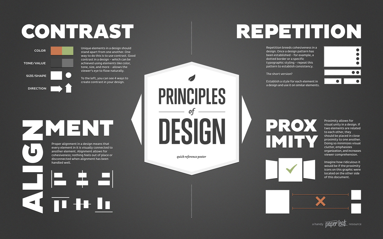
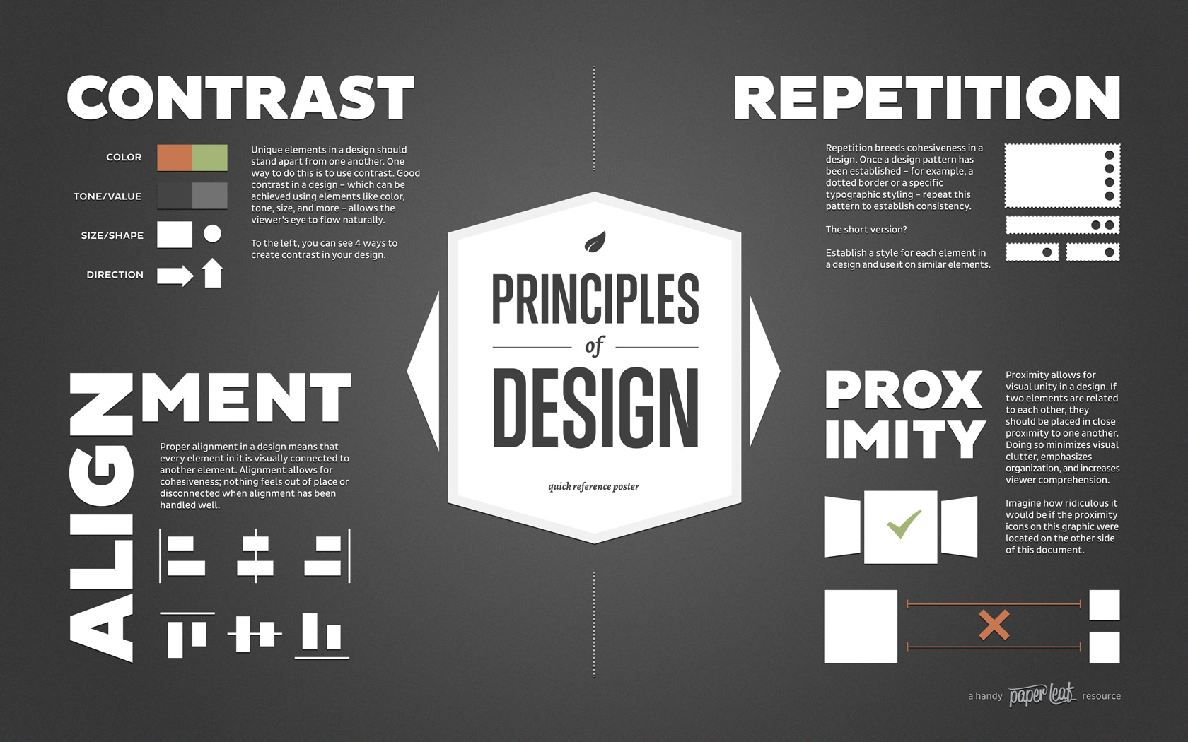
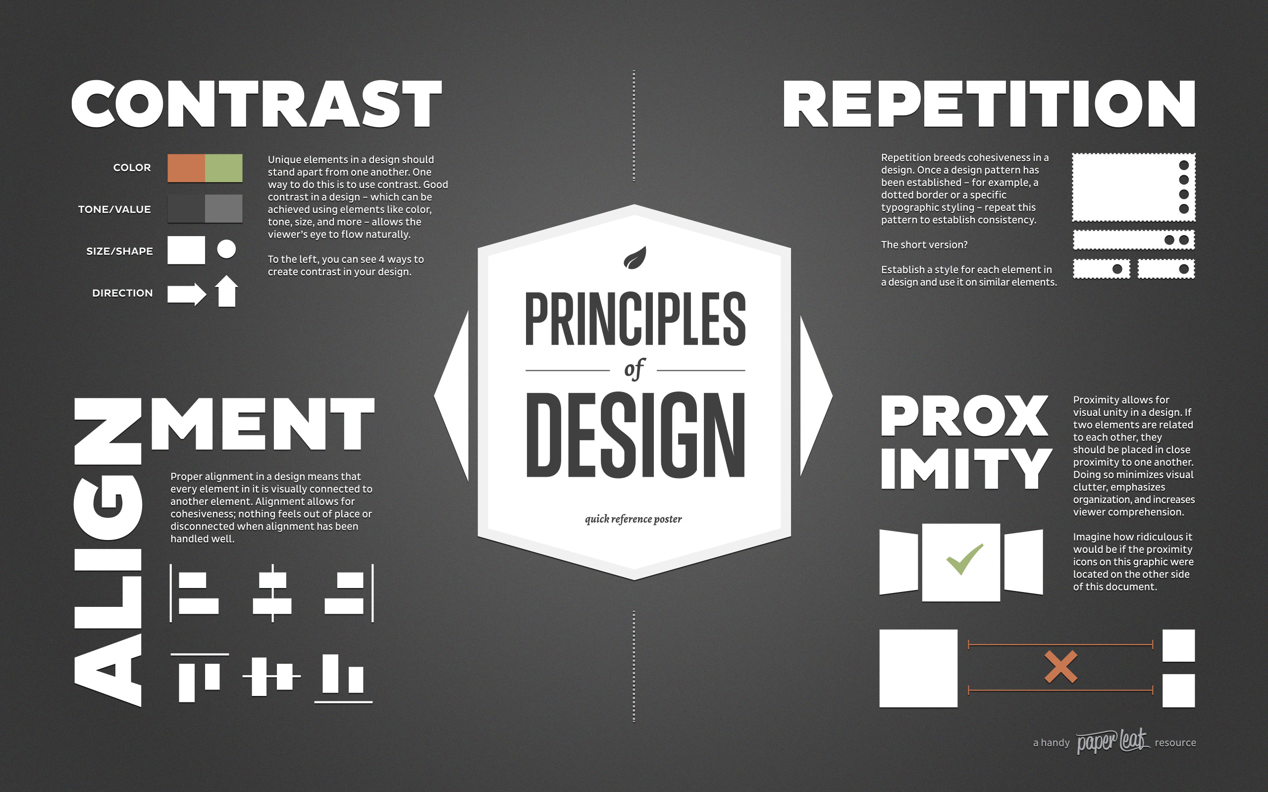
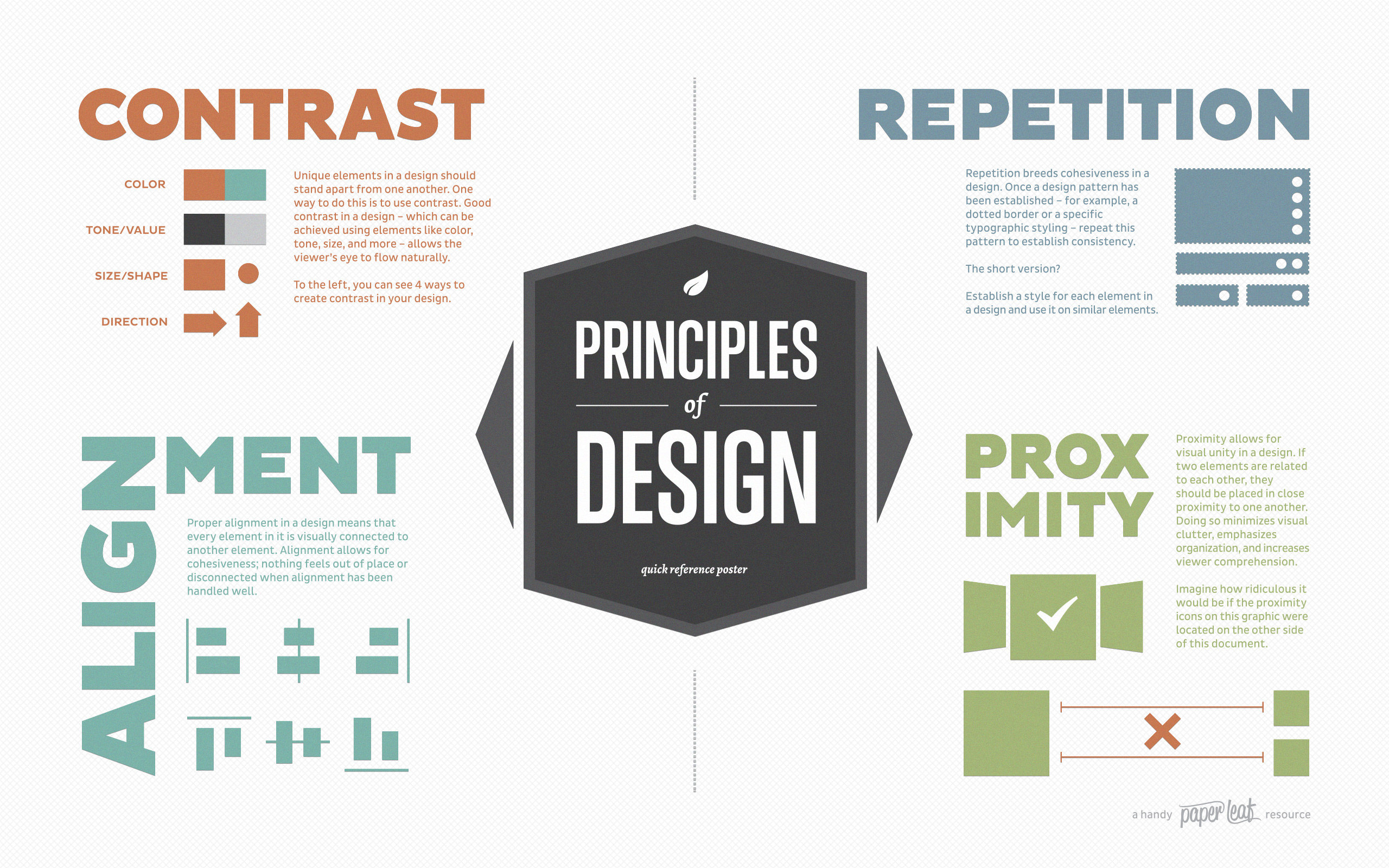
Four principles from Robin Williams, The Non-Designer's Design Book (Peachpit Press, 1994). She teaches them as Proximity, Alignment, Repetition, Contrast - PARC - and CRAP is the rearrangement everyone remembers, which is why I use it.
Contrast
Unique elements should stand apart from one another. Good contrast lets the reader's eye flow naturally instead of hunting. The poster gives four ways to create it: color, tone or value, size or shape, and direction.
Timid differences read as mistakes. A heading one point larger than body text looks like an error rather than a decision.
Repetition
Repetition breeds cohesiveness. Once you establish a pattern - a dotted border, a particular typographic treatment - repeat it. The short version: settle a style for each kind of element, then use it on every similar element.
This is what makes ten pages feel like one site rather than ten pages that happen to link to each other.
Alignment
Every element should sit visually connected to another element. Handle alignment well and nothing feels out of place or adrift. Pick an edge and commit to it - mixing centered and left-aligned text in one block is the fastest way to look amateur.
Proximity
Related items belong close together. Doing so cuts visual clutter, emphasizes organization, and increases comprehension. Closeness tells a reader what belongs with what before they read a word.
Why Naming Them Matters
Williams opens with the Joshua tree principle: once somebody names a thing for you, you start seeing it everywhere. You have reacted to contrast and alignment your whole life without having words for them. The words are what let you fix a page rather than merely dislike it.
Download the Poster





2 • The Elements of Design
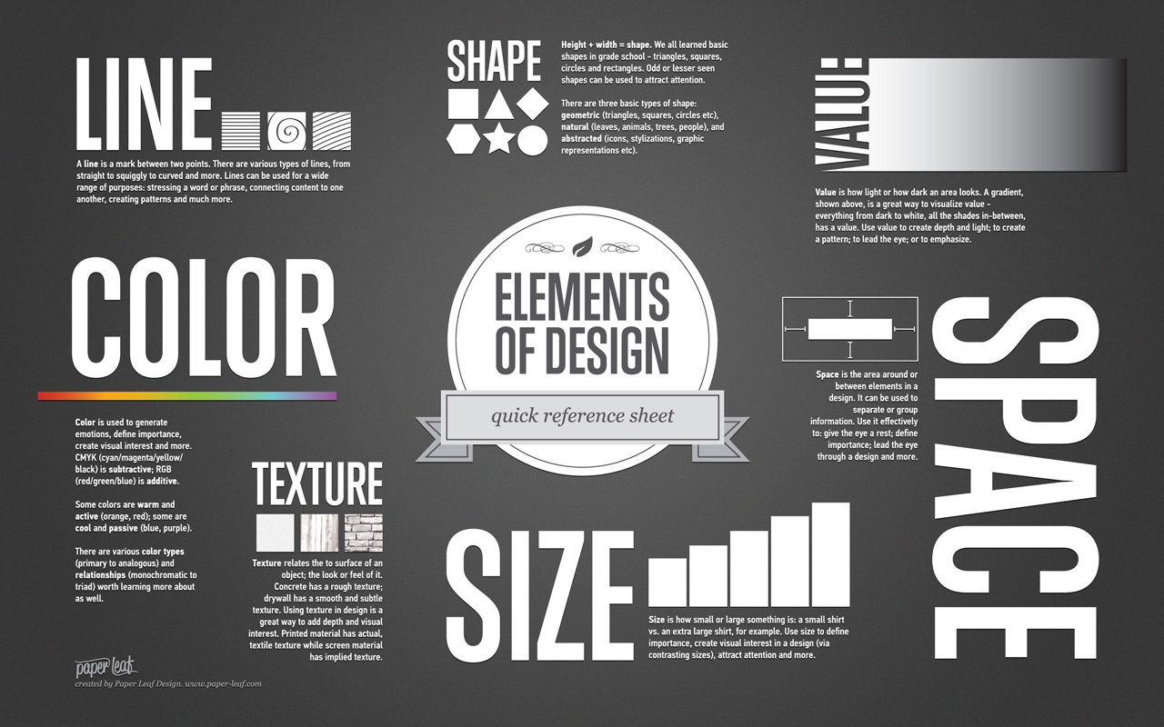
The principles arrange things. These are the things - the raw material every layout is built from.
Line
A mark between two points, straight or curved or squiggly. Lines stress a word, connect one piece of content to another, and build patterns.
Shape
Height plus width. Three basic kinds: geometric (triangles, squares, circles), natural (leaves, animals, people), and abstracted (icons, stylizations). Unusual shapes attract attention precisely because they're unusual.
Value
How light or dark an area looks. A gradient makes it visible - everything from black through white has a value. Use it to create depth, build a pattern, lead the eye, or emphasize.
Color
Generates emotion, defines importance, creates interest. CMYK is subtractive, RGB is additive. Some colors are warm and active (orange, red), some cool and passive (blue, purple). Section three covers the rest.
Texture
The surface of a thing - how it looks or feels. Concrete is rough, drywall smooth. Printed material has actual texture; screens only imply it. Either way it adds depth and interest.
Space
The area around and between elements. It separates or groups information, gives the eye a rest, defines importance, and leads a reader through a design. Whitespace is a tool, not what's left over.
Size
How small or large a thing is. Use it to define importance, create interest through contrast, and attract attention.
Download the Sheet


3 • Color Theory
Consult this before you pick your brand palette, not after.
Two Ways Color Is Made
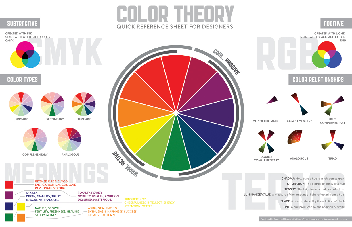
- Subtractive (CMYK) - created with ink. Start with white and add color. This is print.
- Additive (RGB) - created with light. Start with black and add color. This is your screen, and your CSS.
The Wheel
One half runs cool and passive, the other warm and active. Color types step out from primary to secondary to tertiary, then complementary and analogous.
Relationships Worth Knowing
- Monochromatic - one hue, varied in value
- Complementary - opposite each other on the wheel
- Split complementary - a hue and the two beside its opposite
- Double complementary - two complementary pairs
- Analogous - neighbours on the wheel
- Triad - three, evenly spaced
Terms
- Chroma - how pure a hue is relative to grey
- Saturation - the degree of purity of a hue
- Intensity - the brightness or dullness of a hue
- Luminance / value - how much light a hue reflects
- Shade - a hue with black added
- Tint - a hue with white added
What Colors Tend to Mean
Worth knowing, worth not over-trusting - these associations are cultural rather than universal.
- Red - fire and blood, energy, danger, love, passion
- Orange - warmth, enthusiasm, happiness, creativity, autumn
- Yellow - sunshine, joy, intellect, energy, attention
- Green - nature, growth, freshness, healing, safety, money
- Blue - sky and sea, depth, stability, trust, tranquility
- Purple - royalty, power, nobility, ambition, mystery
Download the Poster
- Wallpaper: 1280 · 1440 · 1680 · 1920
- Full sheet, white background
- Original post, which also has the 11×17″ 300 DPI PDFs and the .eps source


Paper Leaf credits worqx.com and color-wheel-pro.com as sources for this sheet.
The Web Standards check what a machine can. All of the above is the part you've to see for yourself.